Thumbnails cannot be underestimated! Repeat five times.
Will Terry's Composition class kicked my butt - something I BADLY needed - so, with butt stinging and mind cleared I attacked the problems anew. Oooh. Reminds me of my Oliver story...
Thumbnail-sized storyboards are done to establish a pattern/rhythm in page design, to lay out what goes on each page (after text is divided), and create each view or 'camera' angle. From here, each tiny sketch is blown up and more detail is added, until all pages work, then it's taken to full size. Phew! A LOT of work!
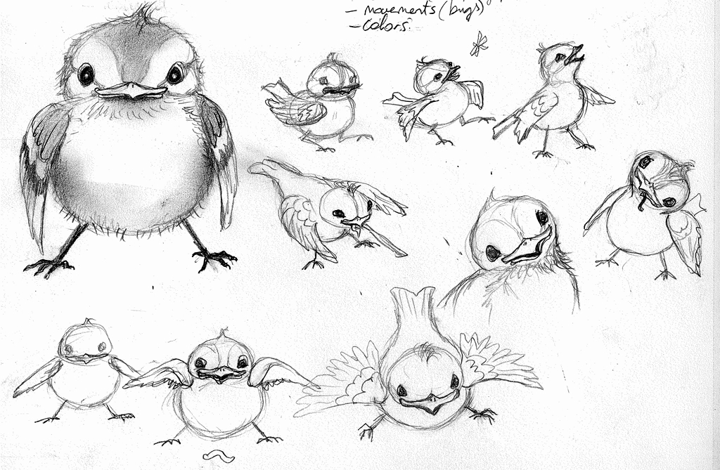
The book now has rhythm, varied angle/curved lines, split panels, and creative 'camera' views - MUCH better than before! Take a look at the below thumbnail-sized storyboard. IF you can tell what's going on, congrats....but this is meant for my planning only. Oh - and I finally did character design sketches of Oliver, below! I'm still working on Max and Momma.
I have only TWO months to make each of these full-sized detailed drawings AND paint two of those scenes...(can I say 'holy cow'??).


